RUIDO! Magazine
Case Study
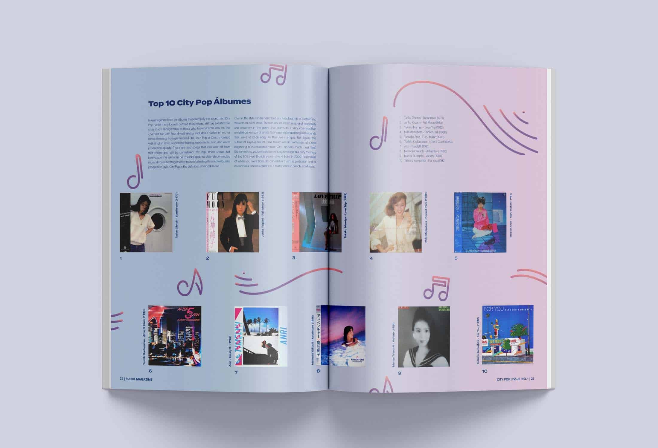
RUIDO! Is a fictional publication that pulls readers into the diverse culture of music around the world. Each issue digs in depth into specific music genres from any country and during any era. My goal was to create a magazine that is all to introduce new music and it’s culture to listeners in amore fun and informative way. Within the issue, readers will find articles that include top song playlists from that genre (Spotify code included for interactive elements), interviews from popular artists, and art prints that can be torn out to make the magazine more engaging.
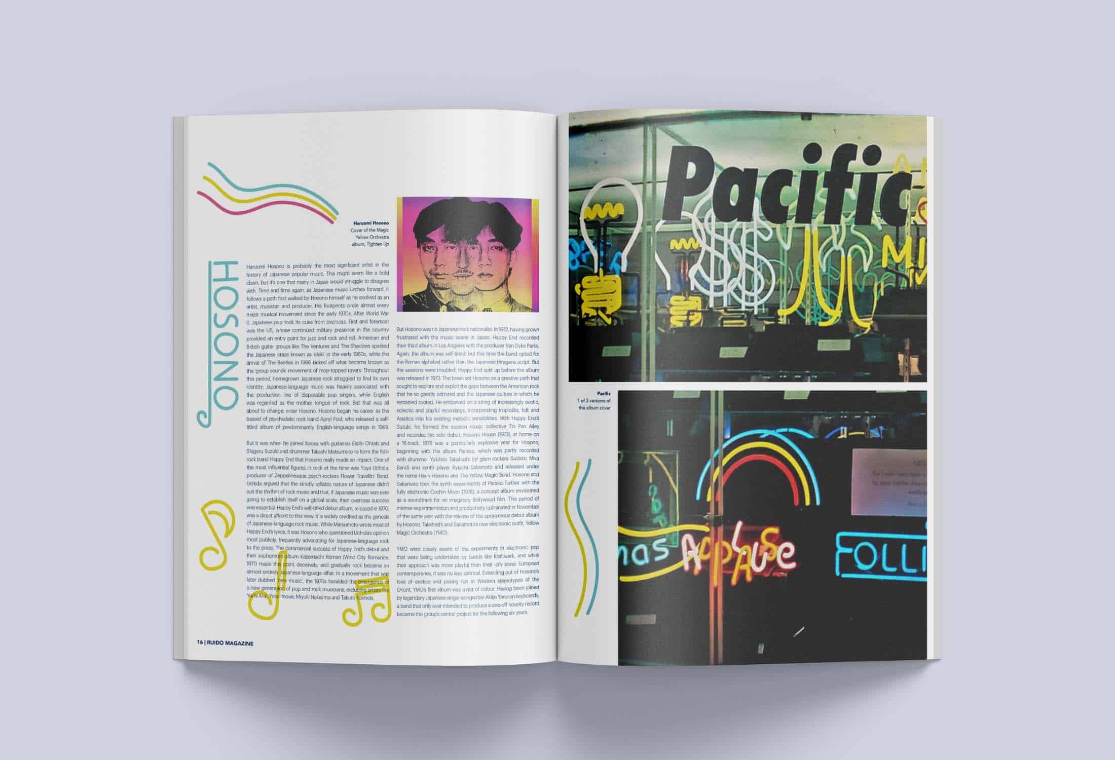
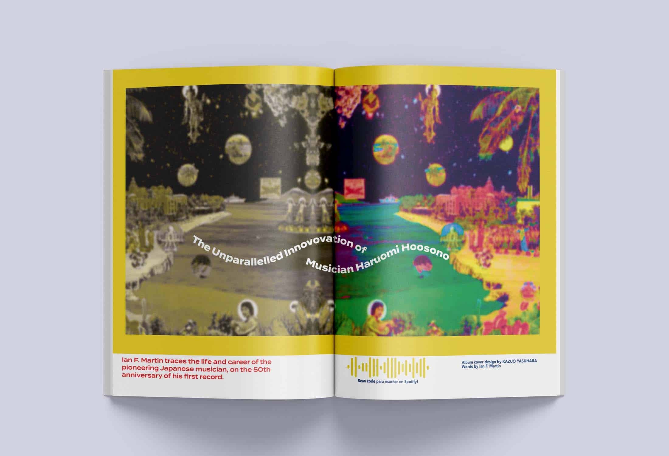
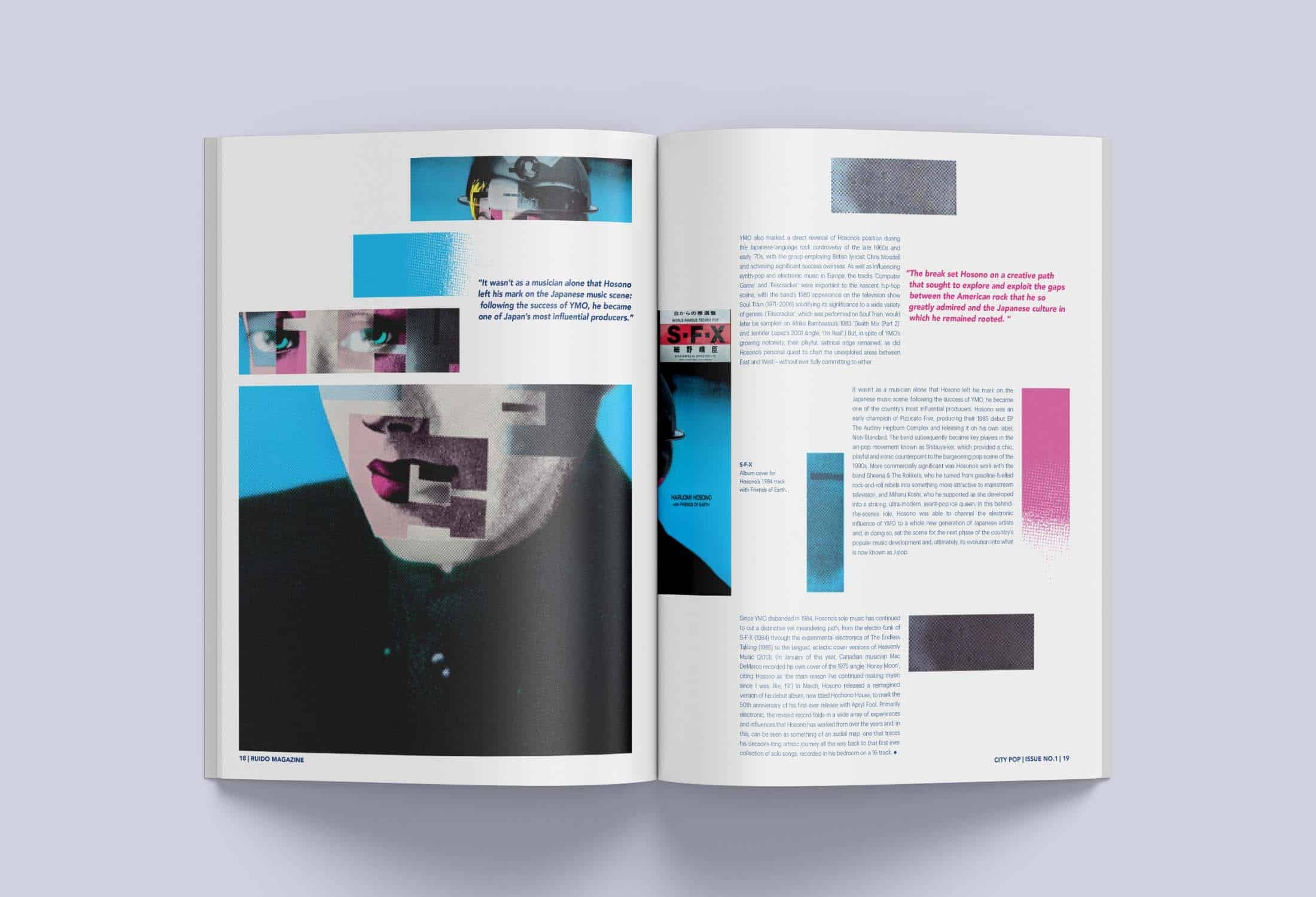
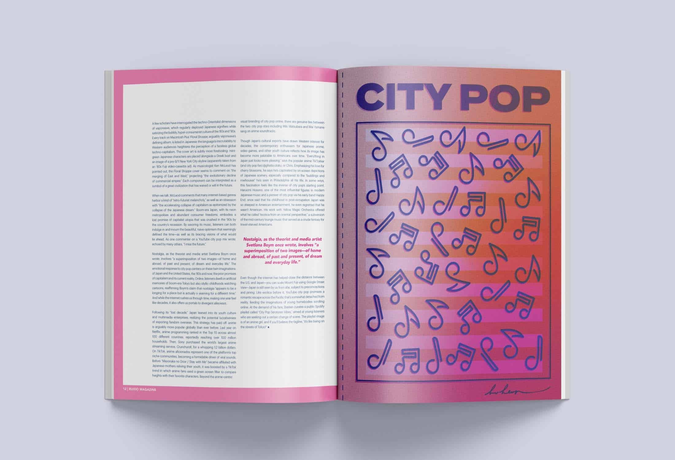
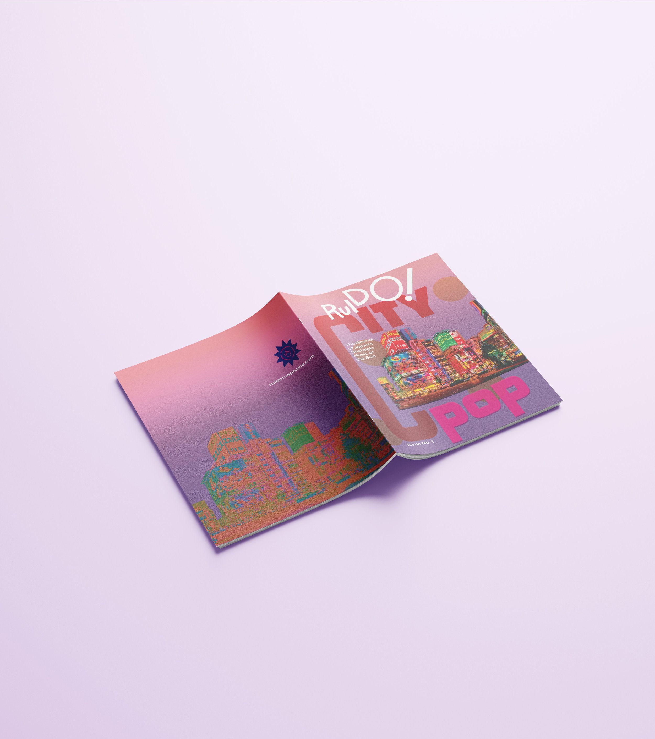
Within this first publication issue, we take a look at the City Pop genre that came about in Japan during the 80s. It communicates the music’s fun and upbeat style through a high energy color palette, illustrations, photography, and typography. All illustrative and iconographic work within the magazine was created by me. I wanted to push for a more contemporary muxic magazine that engages with the reader.
PROCESS
Logo
The name RUIDO! translates from the Spanish word ‘noise’ and was chosen with the intention of adding to the edgy and modern tone of the magazine. I wanted to showcase the flow of music through the logo while keeping it mainly type-based. I began by creating different interpretations of what music “looked” like in a physical form on paper. The flow of the letters is meant to represent the flow of music and as they get progressively larger, they also show the crescendo of music as you turn up the volume.
Logo Sketches
Final Logotype
Planning the Magazine
The color palette contains numerous amounts of vibrant, modern, and edgy colors that can all be utilized to represent the different genres in each issue. The hues for this first issue reflect a high-energy nightlife with glowing colors and gradients that set the nostalgic tone of Japan’s 80s City Pop era.
By utilizing sans serifs, the tone of RUIDO! remains modern and youthful. This was achieved with the use of Termina and Graphik typefaces. Both are clean and sharp that pushes the edgy and high-energy tone of the first issue.
The cover was created in Illustrator and was inspired by album covers and art created to reflect the tone of Japan in the 80s. The vibrant use of a grainy gradient with a cityscape was a popular scene. This idea was also incorporated into the feature spread of the magazine.

HIGHLIGHTS